"The challenge for us was to create a visual language that would both be beautiful but also to speak to the wine enthusiast.
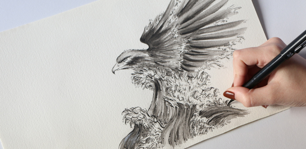
Nami means wave in Japanese. We executed a Kanji Stylized logo to keep in tune with the origin of Sake. The wave has a slight Hokusai style and the eagle takes inspiration from the Mexican depiction of our nation's flag. " - Ancla Studio

This illustration shows an eagle and a wave reminiscent of ancient Japanese illustrations, is part of the packaging and label project for Nami Sake, the first mexican produced sake. Using traditional technique: watercolor for the base and ink for details.


Project done at Ancla Studio®
Photos and mockups by Ancla Studio®
Thank you!
(・ω・)ノ
